Bloom & Wild | Lead Product Designer | iOS & Android
Bloom & Wild is the leading floral gifting destination, helping customers send meaningful gifts with ease. While the app had grown steadily, customer insight revealed difficulties with browsing the range. We needed to improve the discovery experience to make gifting simpler for users and more scalable for the business.
Our research revealed that our product range wasn’t easily discoverable, especially as we expanded beyond flowers into a wider variety of gifts. The app’s outdated navigation, originally designed for a small range of bouquets, no longer supported the larger range.
Taking an iterative approach, we went after a couple of the smaller, known opportunities first whilst validating our Big Bets.
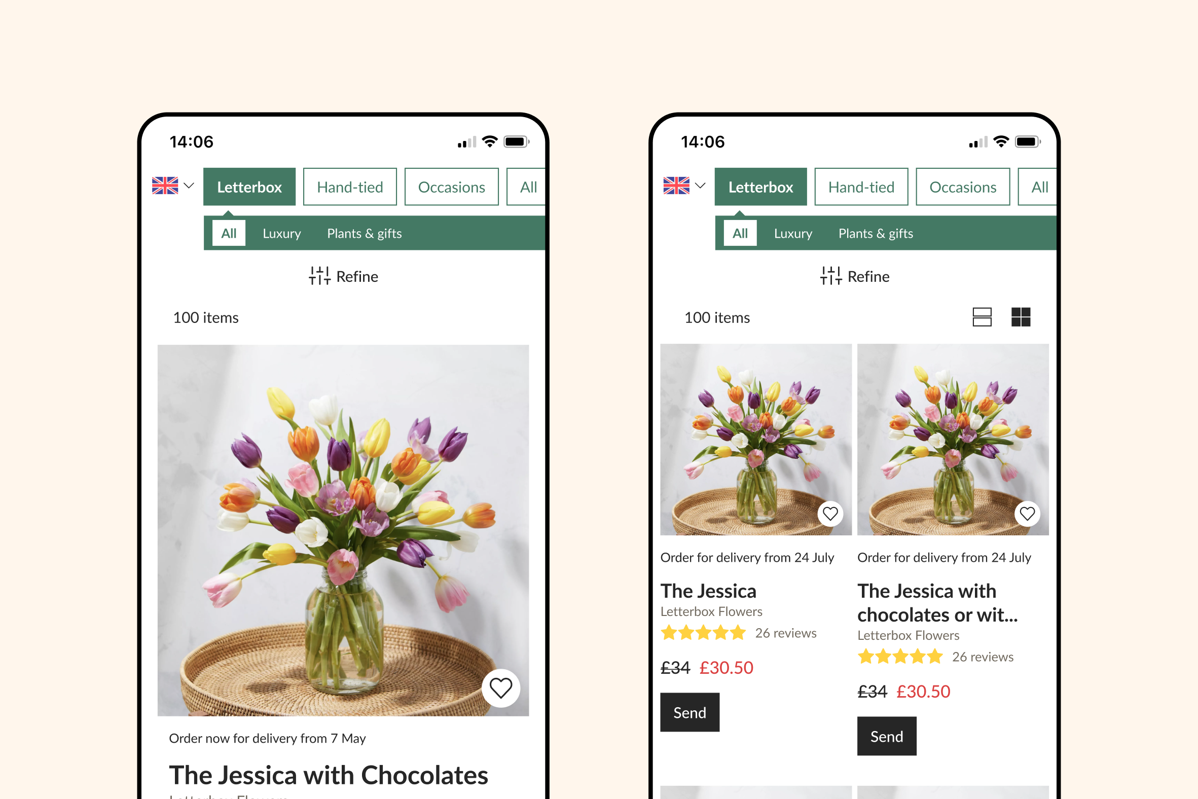
Grid view vs. single product scroll
Introducing a grid view allowed customers to see multiple products at once, making comparison easier and speeding up decision-making. Result: statistically significant increase in RPU and CVR.
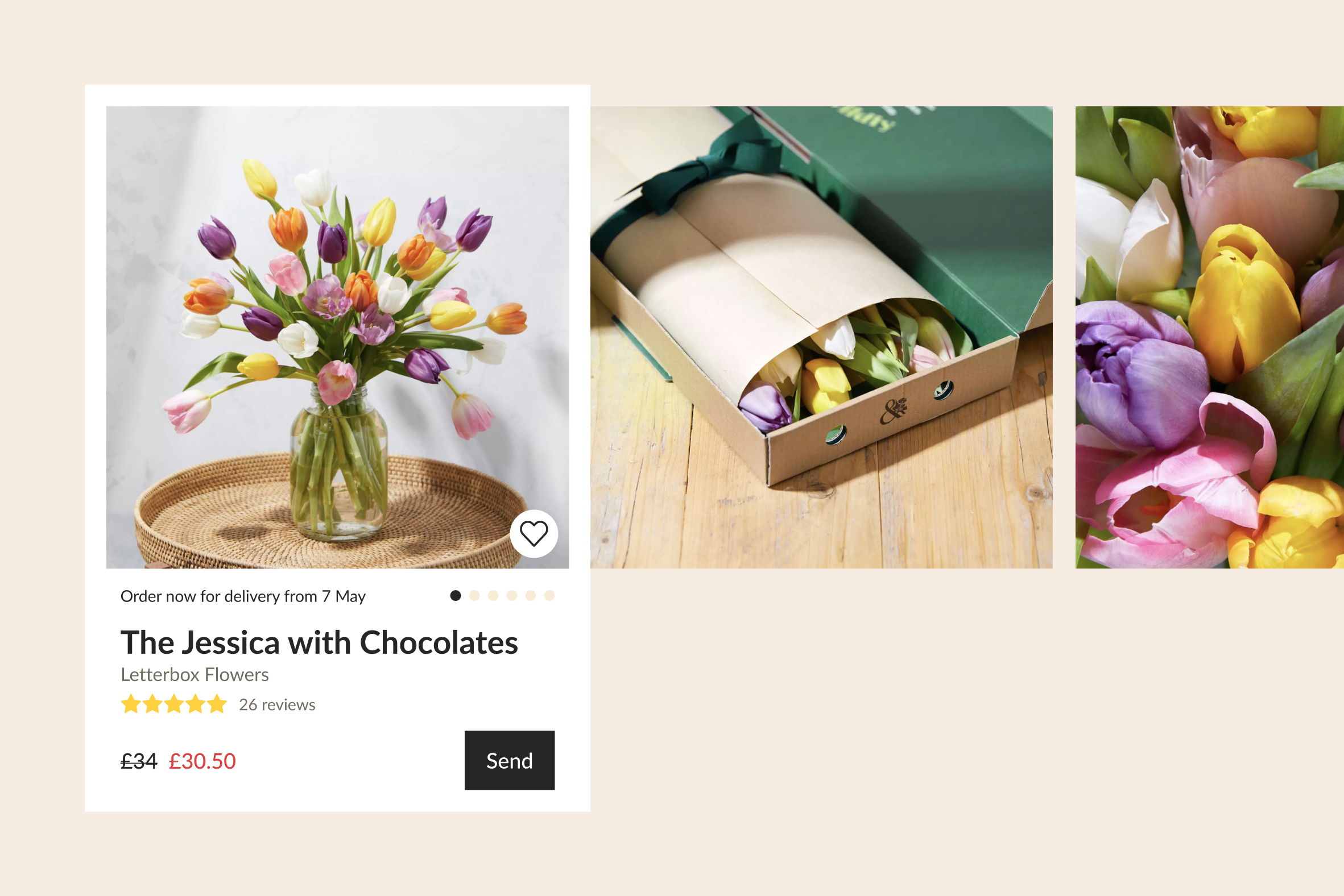
Carousel imagery on product cards
Since photography is our strongest conversion driver, we enabled image carousels within product cards to show more imagery and how gifts would arrive to build customer confidence. Result: significant increases in CPU and NPS.
Helping users refine and supporting customer mindset
One of our established customer mindsets, is around a fear of missing out on the perfect product — which drives users to browse the entire range. To reduce overwhelm and improve their journey, we needed to provide better ways for them to narrow down their options in a way that supported them.
Areas for opportunity
A clearer navigation IA that suits our customers mental models
Explore more familiar UX patterns for our navigation structures
More defined roles to differentiate filters from the navigation
Space for product awareness and to highlight newness


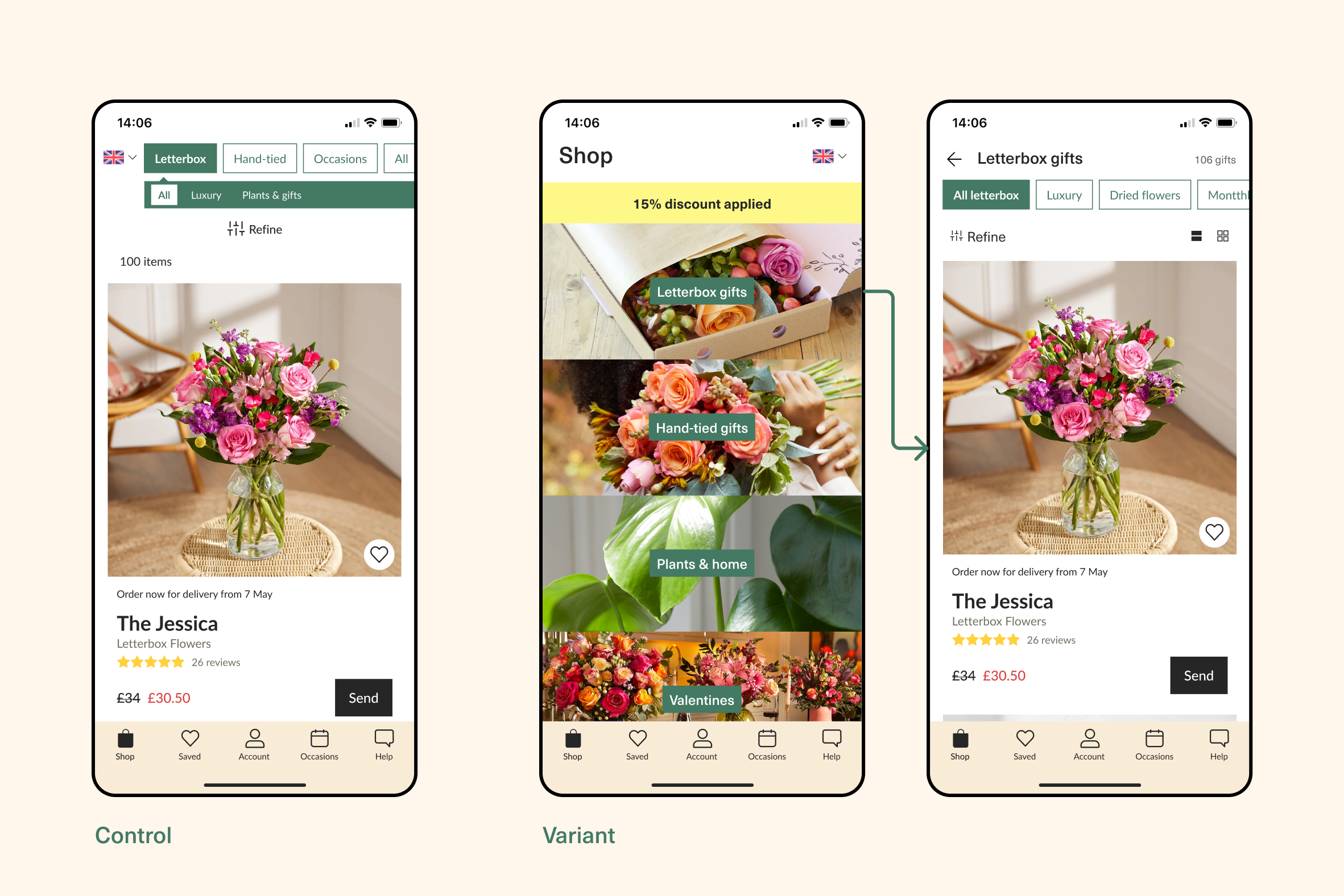
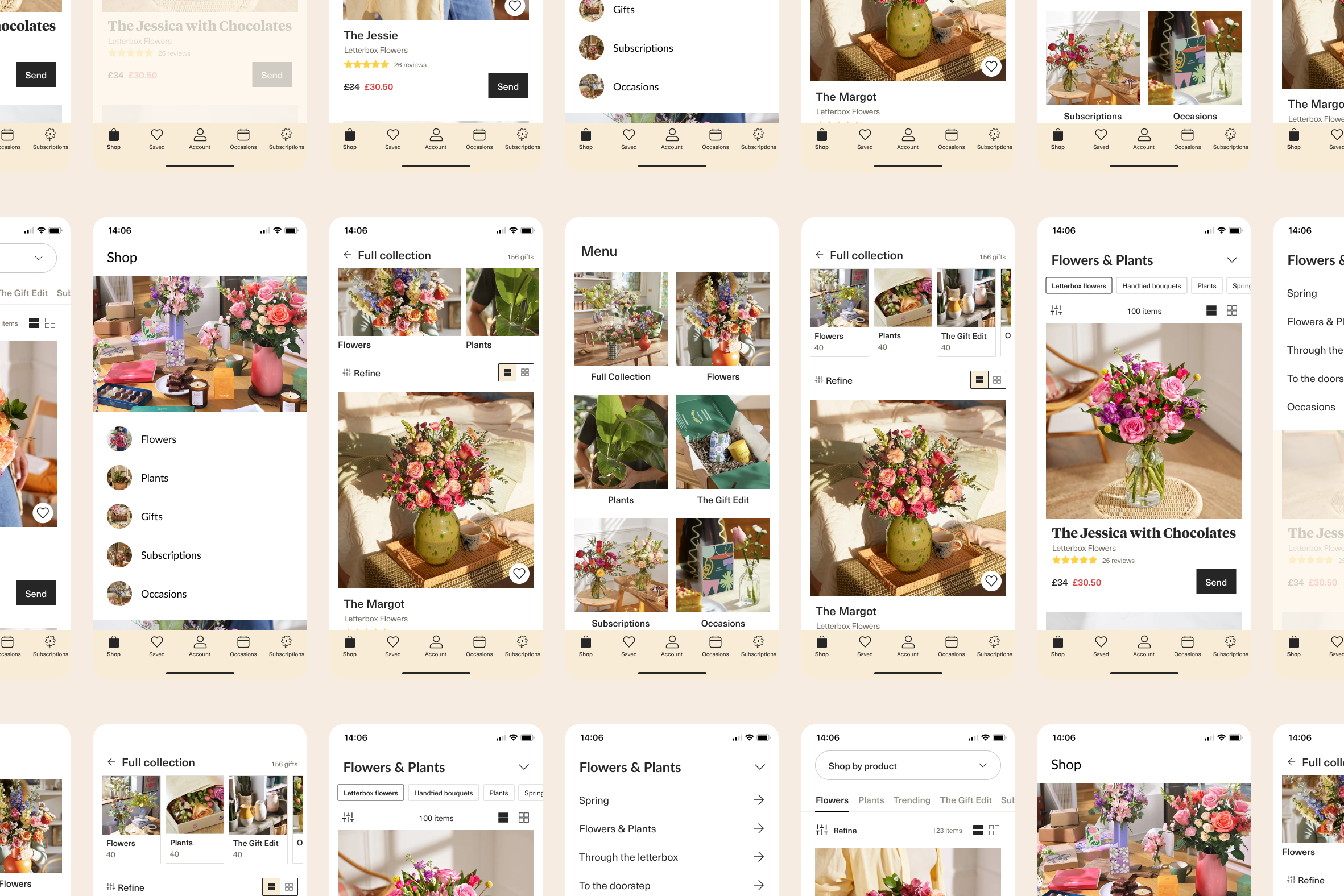
Evolving the navigation to inspire discovery
The existing navigation had reached its limits — both the IA and UX were stretched. To address this, we tested a new design direction that leverages our distinctive brand photography to inspire exploration and implemented a two-step navigation process.
We hoped this approach would help guide users while supporting future expansion. Although the test increased awareness and CvR of smaller product categories, it didn’t deliver the level of uplift required for a full rollout.
We did discover that many users opted to view by ‘All’ products, reinforcing our established customer mindset of fear of missing out.
Swim Shallow, Dive Deep was our next Big Bet
We shifted our approach to Swim Shallow, Dive Deep. Allowing customers to “swim shallow” by quickly scanning a broad range of gift options at the surface i.e. All products, then “dive deep” into the range once something caught their eye through other opportunities such as filtering.
For gifts like flowers, timing is everything — the right product on the right day can make all the difference. Recognising this, and the fact most app users order within 48 hours of delivery, we made delivery date the first filter we introduced. Testing it revealed encouraging results and we observed a +1.85% increase in RPU as a consequence of CVR and AOV uplift.
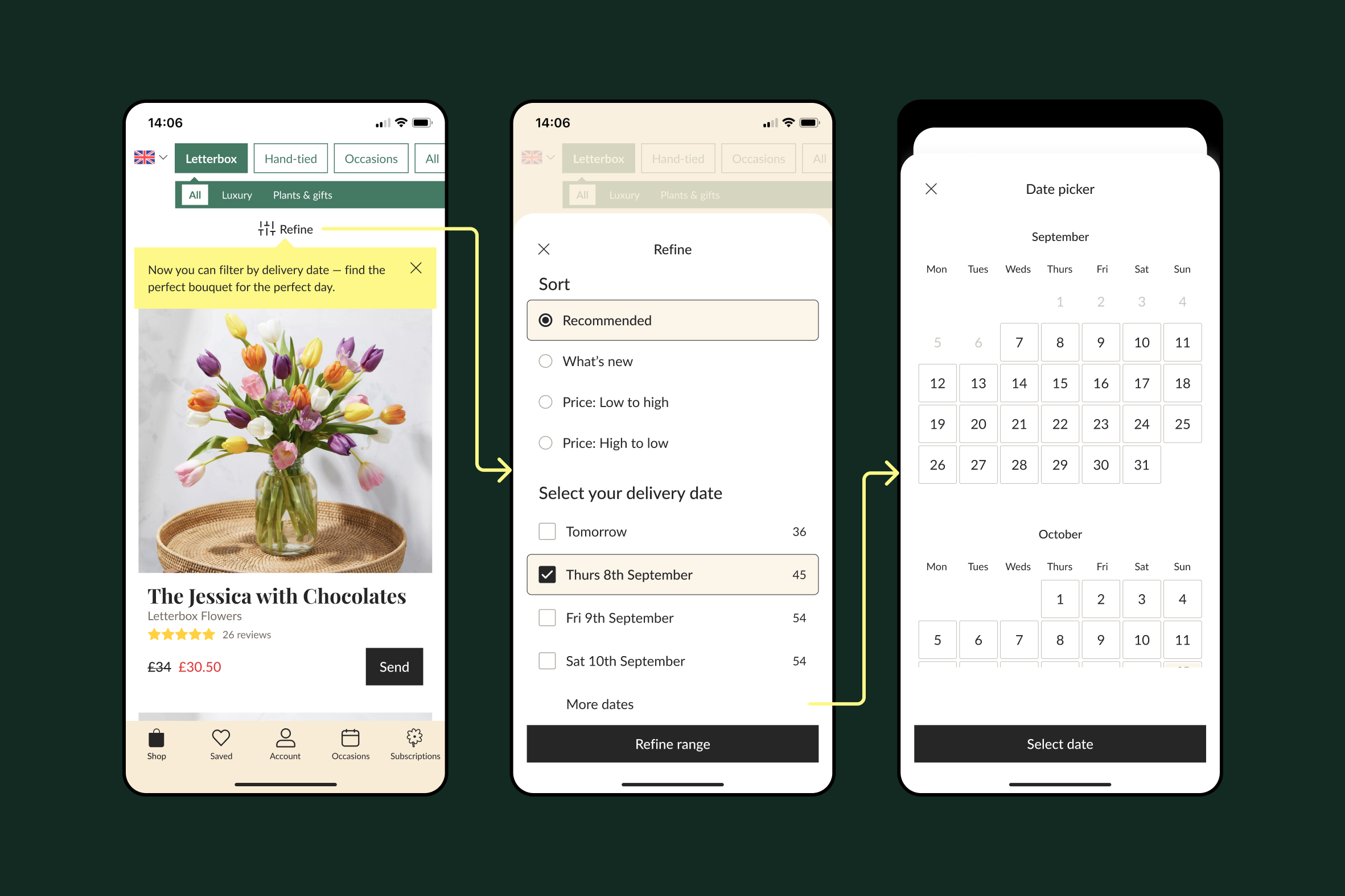
Our first iteration of Filters, with the delivery date filter.
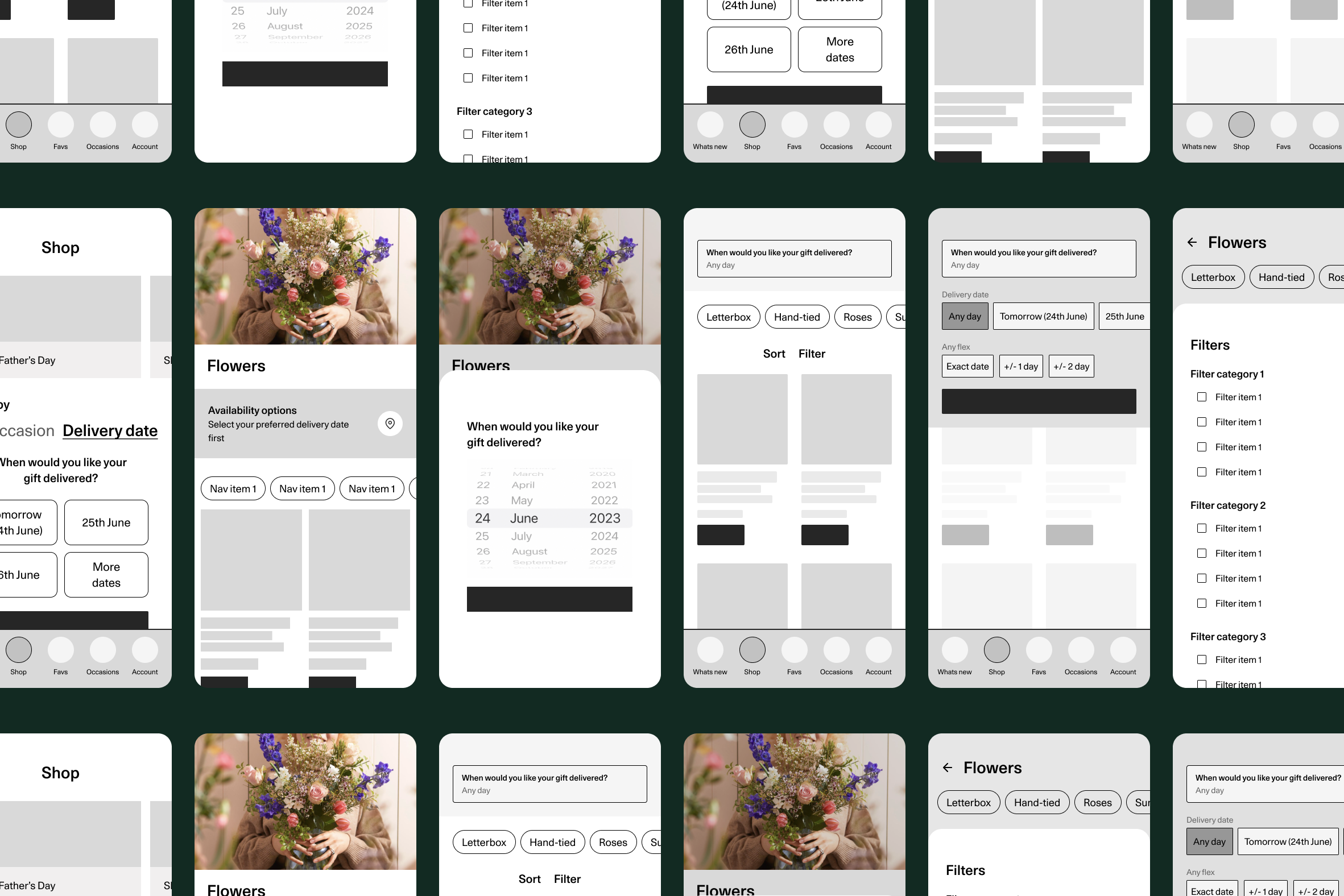
Other ideas for how we might explore browsing by delivery date
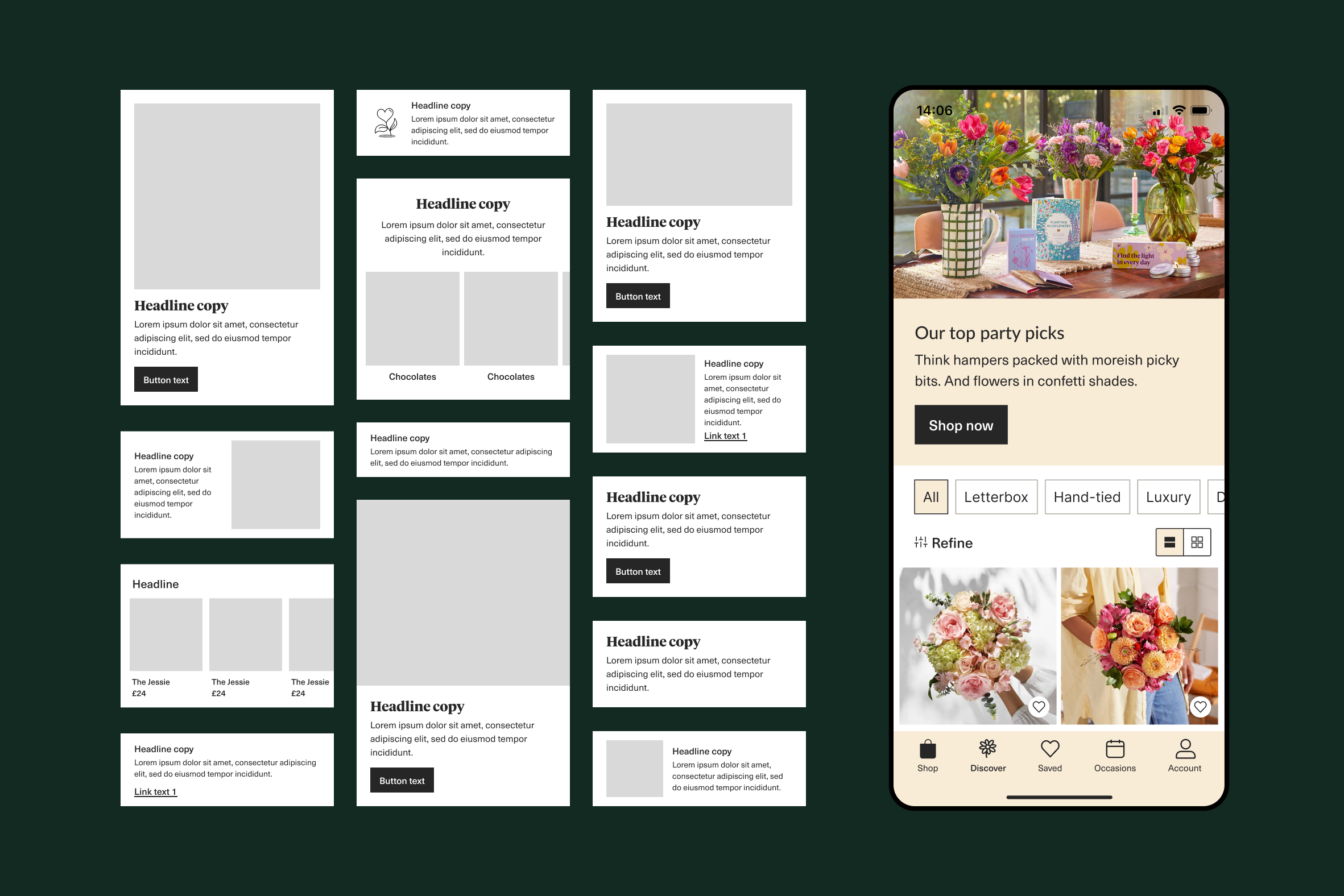
Content focused discovery tab for product awareness and newness
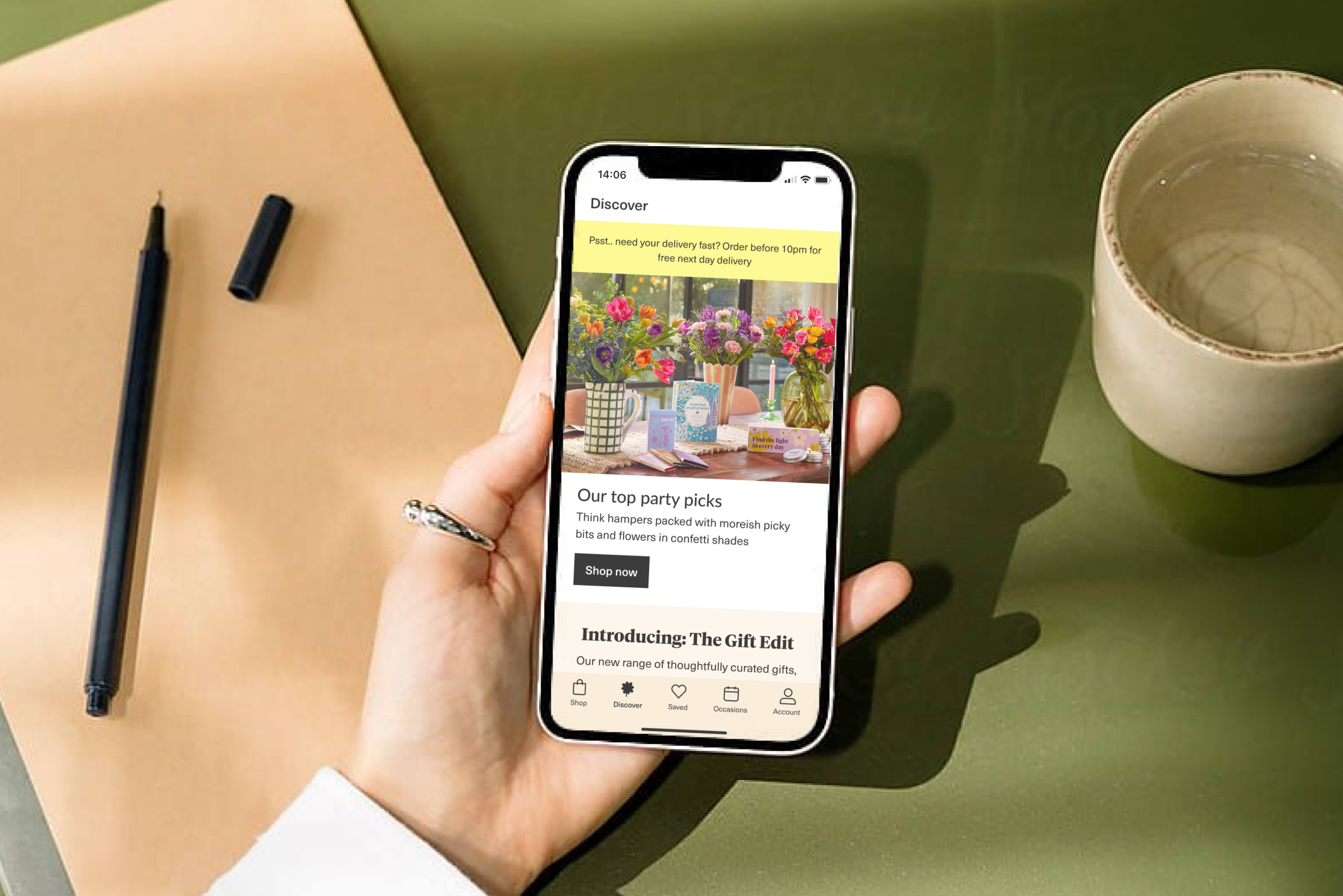
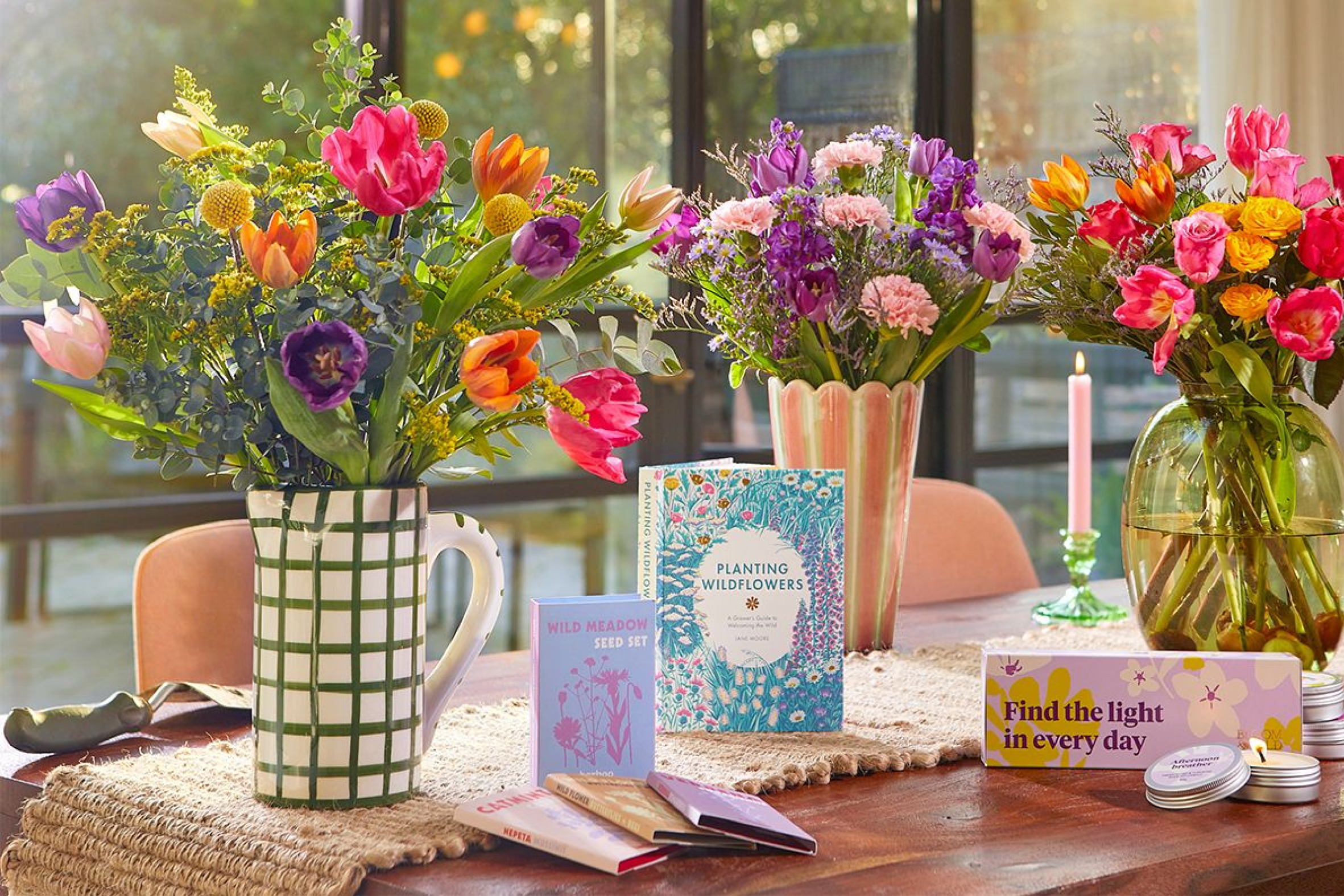
The visual navigation test also highlighted that our occasion category had a higher conversion rate, suggesting that visual categories are an effective way to highlight occasions or newness (something we’d heard before). I explored restructuring the tab bar to create space for newness and designed a content focused discovery tab that could evolve over time to build stickiness, with potential features like occasion reminders, loyalty rewards, and order tracking.
We rolled this out to 100% of users and found a +3.14% increase in user conversion rate and +2.35% RPU, alongside broader SKU visibility. Users engaging with this content were also more likely to have a higher 30-day order conversion rate, showing its impact on both discovery and retention.

An example of components in use on the Discover tab
Suite of Discover components that are housed within Braze to produce personalised, dynamic content